
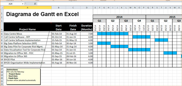
The Gantt diagram, is a graph, a tool that shows the time that is expected to be dedicated to activities over a specified time.
What is the gant chart and what is it for?
In this way the Gantt diagram helps planning when you need to schedule tasks in a simple way where all the actions that are going to be carried out in that given time are displayed.
At the same time, thanks to the graph, it is possible to control how each of the activities are processed and they are monitored.
All the activities are reproduced in the graph with their duration, the sequence and the project calendar.
Actions are linked according to the position they occupy in the schedule. When one of the activities is dependent on the completion of another, it is represented with an end-start link.
The activities can also be assigned to develop them in parallel and they can even be assigned resources with the purpose of exercising control over the person who executes them and is required.
Therefore, it is an essential diagram for the action and control of projects because a practical visualization of the actions that will be carried out can be made, therefore it is a graph or diagram that is linked to the action plans or projects to improve their process , although it is useful for any process as long as it has a temporal definition and it is even useful for projects that are complex and need to be fragmented on the graph.
Gant chart
The Gantt chart was developed in the 20th century by Henry Laurence Gantt. The horizontal bars of the graph where the activities to be carried out in time with specific sequences are ordered.
How to create a Gantt chart in Excel
For any type of project that you manage, you can create a Gantt diagram in Excel like this:
- Open a spreadsheet.
- Leave rows 1 and 2 free
- In row 3 column A write start date,
- In row 3columns B write the days completed.
- In row 3 column D write the remaining days.
- In column A, row 4, 5, 6, etc. write task 1, task 2, task 3, etc.
- In column B you will write the start date of the task that corresponds to that row.
- In column C you will write the number of completed fragments of the task in that row.
- In column D you will write the number of fragments that remain to be completed for the task in the same row.
- In these basic and initial data, click inside any of the data you entered and go to Enter and then in Graphics click Graphics and select column D2.
- You can add a style by extending the graphic and applying an integrated style to it, to do this, keeping the graphic selected you will go to Design and in Design Styles you will click on the arrow that indicates Down to display the options.
- You will see three sections in the columns that correspond to the project start date, the days that were completed, and the days that remain to be completed.
- As the project start date is not too important you will hide the first section by clicking on the first sections, then choose Format, then to adjust the tab click on Shape fill and then on no fill.
- Selecting the column click on Shape outline and select No outline.
- Click on Shadow and then on Shape Effects. Click on Shadow and select No shadow and if you want to deselect the columns click on the bottom of the graph.
- If you want to fix the date range, click on any of them and you will see that Value or horizontal axis that the tooplip tells you.
- In format click Apply format to selection and you will see the options section. Set with the Tab key for minimum x / x / xxxx and maximum x / x / xxxx, the dates will be changed in the boxes to the chosen serial number and the dates entered with Task 1 will be adjusted, etc. by changing the horizontal axis.
- You can also reverse the order of the tasks on the vertical axis by clicking on its name and then clicking on Apply format to selection. Go to Tasks and check Categories in reverse order.
- If you regret that you don’t want the horizontal axis up and you want it back down, click on a date on the horizontal axis and then on Apply format to selection.
- If you want to remove a field, select it with a click and then click on its title and you will subselect it, then pressing Delete will delete it and the other elements will adjust to their position.
- To give the chart a name, click on Chart title and click again to position the cursor and type the name. With Esc twice you will exit the edition and the graphic will be deselected.
In conclusion, to create a Gantt chart in Excel you will start from:
- Basic data of origin.
- You will insert the number of columns according to what your project needs, such as: stages, process, start date, days completed, days left.
- Insert the bar chart for example Bars 2 or 3D stacked, cylindrical, etc.
- Add more columns to the chart you inserted if you need and with the chart selected go to Chart Tools and from Design click on Select data.
- It will show you a dialog box where you will choose Add and in Modify series you will add the new series you need to the bar chart.
- Complete with the data requested, for example indicate the header cell in Series name and the range of cells of values in Series values and do the same for missing days.
- You can convert this chart into a Gantt chart by modifying elements of the chart.
To do this, choose the element according to its name from the graphics toolbar, then click on Presentation and then on Apply format to selection.